Monday, 9 May 2011

cover development


One Hundred Years of Solitude, by Gabriel Garcia Marquez, is the haunting story of 100 years in a small South American town, through the eyes of a single, tragic family. It is beautiful. There is love and death, jealousy and missed opportunity, triumph and decay.


Simple outline drawings for vectors

Adding colour


Wine bottle branding

I think a wine bottle design might provide a good context for me to apply the typeface to. Wine can be a very popular product and people who drink it can be very interested and selective with which wine they purchase. Wines vary in flavor based on the type of grape, country they are grow in, year, alcoholic strength...etc Also they can be dry, sweet, fruity and blended with other natural ingredients and plants. It is these aspects that people take into account when choosing a wine.
Here are some examples of wine bottle design projects that I think are successful and communicate a scene of flavor the wine might have.

This is a luxury porcelain wine bottle and wooden gift box, a product of lavish and extravagance through various materials and processes. Illustrative typography is carried throughout the product, with an accompanying leaflet for wine collectors. This could be a nice way of applying my typeface to a range. A bottle design, packaging and leaflet explaining the typeface and type of wine it is.

This is a nice design for a wine bottle and packaging. It is interesting that the designer has twisted the shape of the reed to form the silhouette of a woman s face. Also, they have photographed the product with the shadow of a tree branch in the background, this provides a soft association to nature and perhaps the ingredients of the wine. Judging on the look of the packaging I would guess the wine would be a strong red with a soft floral taste/aroma.

After completing my bottle and packaging design it might be nice to experiment with shadows as well, when I come to photograph and documenting it.

Below are some more examples of modern wine bottle design and branding.


The Witches, Potion design - RANGE


I had a quick read of 'The Witches' the other day to remind myself of the story. Keeping to the style of the James and the Giant Peach design, above, I wanted to produce one image for the focus point on the cover that has a main reference to the story.
This design is based on the potion used by the witches to transform children into mice. However the plan back fires and the witches end up drinking the potion themselves and become mice.
I have used a purple colour pallet to appear mysterious and magical. I'm not to sure the shape of the bottle is working so I am going to draw out a few more alternatives. i.e the design below looks more like a salt shaker.


I like the purple against the yellow puffin logo. I am still considering the layout and type combinations as well.

Sunday, 8 May 2011

Design idea based on crit feedback

Taking into account of what was said in the crit the other day have attempted another design idea. I like the original drawing however once vectored with colour added it is not as nice as I originally thought it might turn out. I don't want to dwell on this design and continue with trial and error. So I am going to come up with some more design directions and colour pallets.

Wednesday, 4 May 2011

Poster designed to scale

After producing the previous Mogwai designs and playing around with some colour combinations in Photoshop. It occurred to me that the paint smudges can appear to look like smoke, a nice connection to the 'burning' title. I think the Grey also looks grate against the cyan- blue colour.
Here are some more experimentation s...


These posters have also been designed to the right spec and text content, as outlined in the brief.
W 12 5/8" (12.625)
H 21 3/8" (21.375)
FYI
The black boarders are not part of the design they are only used to indicate the sides of the stock.


I have produced quite a few alternative layouts and now I am starting to go off the design. I'm not sure if they give off the clear 'rock vibe' that I am trying to visualize.

Alternative design


Poster idea

I have been looking through my design context posts and reminded myself of Karren's work. The band posters she designed work so well, I thought i'd have ago myself and produce a Mogwai version.
I scanned in a few water colour splodges into Photoshop. Then picked out three with that had an interesting bleed shape, added colour then layered and altered the opacity. Then finished off with placing the vector and type.


This design is to A3.
(Black boarder is not part of the design, it is only there to show the sides)


I like this design and think it has tuned out quite well. The cyan-blue adds a good connection to Mogwi as it is already apart of their branding. However I think this colour combination is perhaps to cheerful to represent this loud rock band. Also it is to much like Karren's design, I don't want it to be a blatant rip.

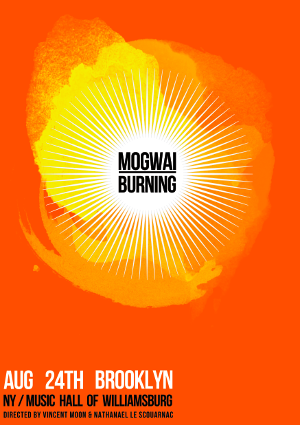
This second design uses flame colours based around the title 'burning'. The burnt orange colour is grate! I also think the red and yellow are a good colours to contrast with the black text adding a bit more energy to the design and reference to a rock band.
However I think the big yellow splodges appear to much like the sun and I don't want this association in the design, as it might course a misleading context for the viewer.

Again these designs are to A3 and black border is not part of the design.


Tuesday, 3 May 2011

Range?


I have been considering what to do with the type face and how to place it into a context. The type is based on twigs with no greenery, berries or leaves. So I thought it might work well to advertise a dry white wine.
Here is a quick mock up of how the typeface may appear on the bottle.
It looks quite messy and difficult to read. I considered making the type smaller with larger curing to help distinguish the letters. However If the point size is any small it will lose the detail of the twigs.

Some more poster ideas


The other day I found a grate photograph online of an intense ape's face. As a key theme of the planet of the apes movies is time travel. I have tried to include this theme into the design and make the image appear warn out and bleached with also a bit of sci-fi look.
I cropped it and added a couple of filters for a dotted half-tone effect and a bold contrasting font.