Showing posts with label Brief 4 -YCN. Show all posts

Wednesday, 1 June 2011

YCN final Boards


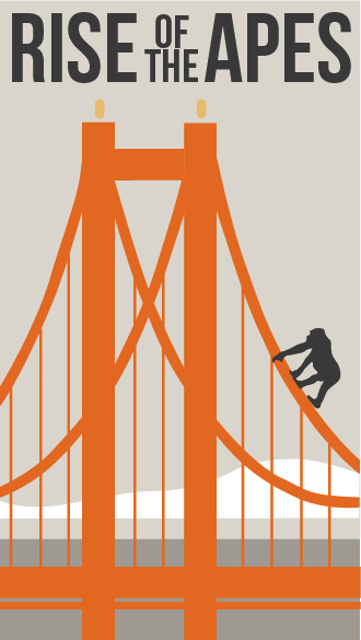
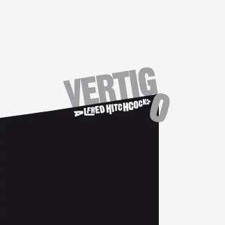
Advertising and promo is something I was very interested in and new a bit about from a placement I had in August. However I ended up putting this brief on hold (thinking it could be a quick turn around) while focusing on the others and so I feel this resulted in being my weakest brief.
I am interested in film and cinema and wanted to see if I could successfully apply my illustrations to advertising and promotion for a movie and how strongly they would work, I am not happy with the outcome, I think I perhaps could have pushed the designs further, I realize I perhaps lost 'passion' for this brief and subsequiantally lost interest within it. I do feel the final pieces were successful and fulfilled the brief but I did not exploit the brief to its full potential. Overall, I think I can apply my illustrations to this type of brief, yet I must push the designing aspect further rather than rushing to develop the final outcome to produce a more susccessful brief.

Friday, 20 May 2011

photograph of printed poster


I wanted this design just to raise awareness of the title an not be to obvious that it is a film, to get people questioning what it is and that way they would probably be more likely to remember the concept. This is why I have not included the release date or the words such as 'in cinemas soon' 'out in August' etc. All this information would be found on the dvd, in the second part of the promotional campaign.

Sunday, 15 May 2011

DVD Packaging design


In the end I chose a blue/white colour scheme, to try and look clinical to go with the blurb on the back of the dvd "... experiments with genetic engineering lead to..."


I think the design would work well as a form of promotion and because it is a dvd people would probably be less likely to thorough it away.
The big flaw in the promotion idea would be the cost to make these dvds.
However they would only be distributed at cinemas to the directed target audience, cinema goers who are already watching films of a similar type, action/ adventure/ horror. So if everyone who receives this free DVD, then pays to see the film, then perches it on dvd release i'm sure this form of promotion would pay off.

The chosen vector design


Design on disc

Friday, 13 May 2011

San Francisco

To gain some more inspiration for this brief I read over the summery of the film again and remembered it is set in San Francisco.
Looking at some images of the city on the web I found this image and thought the climber looked a lot like an ape.
The location is something that sets this 'planet of the apes' move apart from the others and could provide a focal point for the poster.


I have drawn up a minimal vector of the bridge based on late travel poster.


Tuesday, 3 May 2011

Some more poster ideas


The other day I found a grate photograph online of an intense ape's face. As a key theme of the planet of the apes movies is time travel. I have tried to include this theme into the design and make the image appear warn out and bleached with also a bit of sci-fi look.
I cropped it and added a couple of filters for a dotted half-tone effect and a bold contrasting font.


Friday, 1 April 2011

Poster design 1

After I created the type collage effect for the ISTD brief yesterday. Today I have applied the same technique to create this Rise of the apes poster design for the YCN brief. The first uses a photographic chimpanzee image and the second uses an image from a vintage planet of the apes poster. I have tried to position the eyes with in the text to create a sinister tone similar to the movie.


Monday, 28 March 2011

Vector typographic design for DVD collection


Designer Ryan Tym
After recently purchasing a badly designed Alfred Hitchcock
DVD box set, I set to work on creating my own collection of
original covers. Each design features an iconic image related
to the film it represents and includes a bold typographic
title. I also created the reverse cover for each DVD.

Thursday, 24 March 2011

Exploring the Lost "Art" of the Film Poster.

40+ Creatives were given the task of creating their own interpretation of a Cult, Classic or Obscure film poster from the past, whether it be a literal or abstract solution. The result is Now Showing, an Art exhibition paying homage to more than 70 years of film, through the form of Prints, One Off Screen Prints and Sculptures.

Artists who's work was on display include: Mr Ian Wright, Hellovon, Non Format, Corey Holms, Grandpeople, Marian Bantjes, Tomer Hanuka, Pure Evil, James Joyce, Michael Gillette and Many More.


This final poster design is my favorite. It looks crazy! The use of colour, image and large red tongue are perfect to illustrate the madness of the movie. It also does a good job to scare the viewer, same as the film.
All the final poster designs were published in a publication, Monograph. This is perhaps another route I could take the rise of the apes poster brief in.

Monograph is a free, 20-page, A5 booklet from Creative Review, provided as an additional benefit to all subcribers. Each month, it showcases a personal project or body of work. Monograph is distributed with subscribers’ copies of the magazine only and will not appear on newsstand copies.