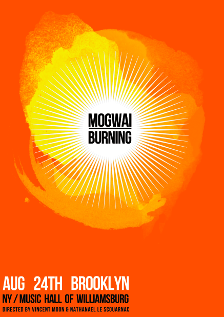
I scanned in a few water colour splodges into Photoshop. Then picked out three with that had an interesting bleed shape, added colour then layered and altered the opacity. Then finished off with placing the vector and type.

This design is to A3.
(Black boarder is not part of the design, it is only there to show the sides)

I like this design and think it has tuned out quite well. The cyan-blue adds a good connection to Mogwi as it is already apart of their branding. However I think this colour combination is perhaps to cheerful to represent this loud rock band. Also it is to much like Karren's design, I don't want it to be a blatant rip.
This second design uses flame colours based around the title 'burning'. The burnt orange colour is grate! I also think the red and yellow are a good colours to contrast with the black text adding a bit more energy to the design and reference to a rock band.
However I think the big yellow splodges appear to much like the sun and I don't want this association in the design, as it might course a misleading context for the viewer.
Again these designs are to A3 and black border is not part of the design.
